Is there anything as close to the American flag as the Dodger uniform? It just has “good guys” written all over it. Almost as much as orange and black lettering on a vanilla background says “bad guys” all over it. Can there ever be any confusion about this? I can’t understand the thought process that would allow you to root for the black hats over the blue. It has to be some sort of demented mentality and is simply un-American in my way of thinking. A few legends in black come to mind: Darth Vader, Simon Legree, Count Dracula and that guy who competes against the Lone Ranger who always wore the dark hat. Ever see any villains in blue or white (with a slash of red)? Superman? The U.S. Marine Corps? The U.S. Olympic team? Yeah, I didn’t think so.
But getting back to the Dodger uniform, I absolutely love the fact that it has a red number on the lower left quadrant on the front of the shirt. Common sense initially tells you that it doesn’t belong there, but its addition absolutely authenticates it as a legitimate Dodger uniform. When I see Dodger jerseys worn by fans without that red number, it is simply not the complete package.
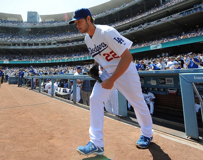
There is nothing more red, white and blue than the American flag … and the Dodgers home uniform.
(Photo credit – Jon SooHoo)
Tommy John said it best in 1989 to Sports Illustrated journalist Sarah Ballard, even as a member of the New York Yankees: “You know what makes the Dodger uniform? It’s the red number on the shirt, I love that.”
The red numbers in front were added in 1952, mainly for television identification purposes. The Dodgers were the first MLB team to make this addition. Within ten years, many other teams had followed suit. Why red? Could it be because of the Dodger logo that integrated red white and blue? I think so. A few years ago while reading on this topic I came across a comment that the red would show up sharper even on black and white televisions of the day. I cannot find the source of that comment and I don’t even know if it is true or if it was a dream I had. So I’ll stick with the logo color scheme as the reason for the red number.
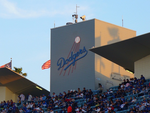
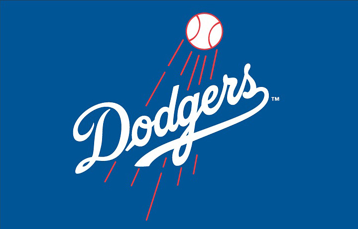
The “shooting ball” logo has had its font tweaks over the years (even as recently as this year), but the color scheme has remained the same and the red color for the ball and the streaks has always been prominent. Take a look at the font thickness of today’s shooting ball logo and the one when the Dodgers arrived in Los Angeles. We used to see the older logo everyday in the top deck of Dodger Stadium, where the older style font was prominently displayed front and center, with the skinnier font. Unfortunately, the Dodgers updated this a few years ago to the newer logo with the thick font.
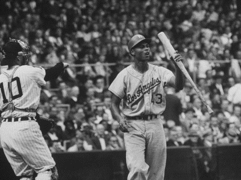
That uniform numeral in the jersey front has always assisted with age photo identification purposes. If I see an old Dodger photo with a caption identifying the year of the photo, I know immediately if the author is correct or not. If the Dodger in a home uniform was pre 1951, there would be no number on front. It wasn’t until 1959 that the red number on the front was added to the road jersey. In baseball historian Marc Okkenen’s excellent historical uniform research for each team, he recorded that the Dodgers didn’t have the red number on the away uniforms until 1960. That turned out to be an error in his research because there are prominent photos from the 1959 World Series showing the Dodger road uniforms with the front jersey numbers.
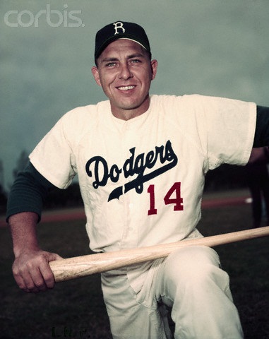
It should be noted that the Dodgers had different versions of the red number on their home uniforms in the early years. There were some with skinnier font lettering and others with the thicker numbers. There didn’t seem to be any control of which uniform that would be worn. It has been recorded by some amateur historians over at the baseball-fever.com message board that the Dodgers had three different home uniforms that had different font versions of the numbers. Participants in that forum have cited that Hodges seemed to prefer the skinnier font and regularly wore that uniform. There is no authentication if those facts are true, but it makes for interesting conversation. It looks as if there was no control over the font size of the letter in the earlier versions of the uniform. Hodges wears both thin and thick versions of his number on the uniform archived photographs.
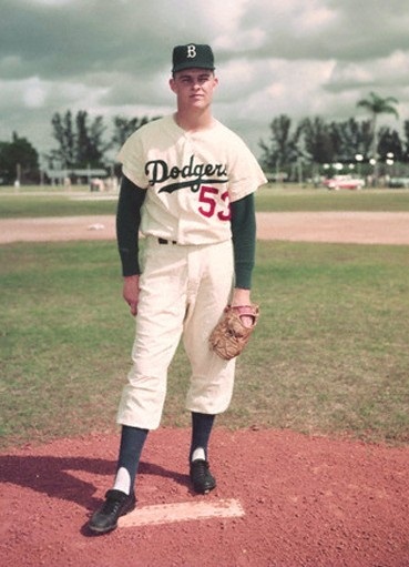
Then there is Drysdale with the slimmer font number…
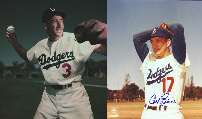
…compared to Billy Cox and Carl Erskine from 1952
In my biased and expert opinion, I must say that one thing that is certain: the Dodger uniform is the crispest and most perfect baseball uniform to be found in the game. It should be noted that ESPN’s Jim Caple, (a self admitted Giant fan), recently ranked all of the MLB uniforms in countdown order from 30 to 1 and the L.A. Dodger uniform topped his list as the best. If even the enemy can admit this, it says a lot.
* * * * * * * * * * * *
(Article re-posted from April 18, 2012)


 June 19th, 2018 at 8:00 am
  by Evan Bladh
 Posted in
The lettering on the uniform that Hodges is wearing goes back a long way.
I just looked up the Pantone number for the blue in the flag last week.
Sorry, it’s 282.